In-Depth
Windows 8 Consumer Preview: An iPad User's Review
A review of the Windows 8 Consumer Preview on Apple's tablet finds the OS visually and substantively good enough to be worth the sizable learning curve.
- By Scott Bekker
- May 03, 2012
The Windows 8 Consumer Preview came out on Feb. 29, but I purposely avoided loading it right away. The reason was simple. Windows 8 represents the biggest set of changes to the Windows OS since Windows 95. All the countless changes boil down to one thing -- a touch-first user experience. I didn't want my first impression to be based on running Windows 8 on a non-touch system. It would miss the whole point. In fact, other observers have noted that reviewers who tried the preview on a touch tablet generally liked it, and those who tried it on a standard desktop generally didn't.
Those of us without handy access to Windows 7-generation tablets for testing the OS got a break on April 12, when Splashtop Inc. launched its "Win8 Metro Testbed." The testbed is a remote desktop application that displays Windows 8 from a PC on an Apple iPad. It's more than just a screenscrape, though -- what's important about what Splashtop has done is the company took the innovative gestures Microsoft developed for Windows 8 and made them work on the iPad.
Having access to an iPad, I downloaded the Consumer Preview and took it for a spin. If you're looking for observations about performance, you won't find them here. Many things are to be forgiven in preview code, and on top of that this review depends on third-party remote desktop software to test the OS. (That said, I don't want to give the impression performance was bad. Even Microsoft's new pinball game worked extremely well over the Splashtop version.)
One final point about where the Consumer Preview fits. Microsoft has four broad usage scenarios for Windows 8. There are traditional keyboard-mouse desktops, touch-enabled desktops, x86 architecture-based tablets and ARM-based tablets. The Consumer Preview covers the first three use cases, where compatibility is provided for older Windows applications. The ARM-based tablet version will support only new Metro-style apps and is entirely consumer focused. In other words, despite the name, the Consumer Preview isn't really the consumer-only version.
What follows are four definitive screenshots from the Consumer Preview, with each serving as a jumping off point for a discussion of important elements of Windows 8.
A Thing of Beauty
This OS was absolutely gorgeous in demonstrations last spring, and the hard choices of the product's interim development have done nothing to diminish its looks.
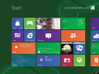
The Start screen with its Metro tiles is a joy to look at (Figure 1). Color customization is easy to figure out and offers a limited selection of bold color and pattern options for the main screen. The lock screen image choices are also exceptionally inspiring and inviting.

[Click on image for larger view.] |
| Figure 1. The Start screen. |
The display of the "charms," a set of tools that appear along the right edge of the screen when swiping in from the right, is subtle and natural. The act of dragging in applications from the sides and watching them quickly take over the screen is appealing. Metro app tiles on the Start screen sport bold, inviting colors.
Nonstarter
Using Windows is deeply disorienting in Windows 8. This emerges most clearly in the Desktop mode. You get there by tapping on the "Desktop" app on the Start screen.
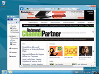
Once there, the most noticeable thing is that there's no Start button. Even having read endlessly about Microsoft's decision to remove the Start button, the absence remained jarring (Figure 2).

[Click on image for larger view.] |
| Figure 2. Desktop mode; notice the missing Start button? |
The lack of a Start button is a pretty good metaphor for using Windows 8. Doing anything is an adventure of discovery, and previous Windows experience isn't always an asset. The simplification of options and actions is intense and hard to get used to.
Next Page >>
Cramped Style
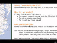
Back on the native Metro side of the UI, one of the major features is "snapping" two apps on the screen (Figure 3).

[Click on image for larger view.] |
| Figure 3. Two applications "snapped" side-by-side. |
There are two ways to look at this. Compared to an iPad, it's a 100 percent improvement on how many apps you can view at one time. Compared to legacy versions of Windows, two open windows are not very many, especially with the size of some of the available desktop touchscreens.
This seems like a major limitation for power users accustomed to computing with dozens of windows and tabs at all times, but the jury's still out. After three days of use, it's impossible to say whether sliding open apps in from the side will fit into a natural and productive workflow, or if it'll be necessary to hang out in Desktop mode most of the time.
Training Required
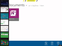
Figure 4 shows what happens when you swipe slowly from the left edge, then swipe back quickly. All the open apps appear along the left edge. This is nice, but kind of complicated. Which is a pretty good way to describe all the Windows 8 gestures. (Another case in point: In three days of playing with the OS, I was never able to successfully snap apps using gestures. To get a screenshot, I had to right-click on an app with a mouse.)

[Click on image for larger view.] |
| Figure 4. A two-step gesture shows all open apps along the left side. |
This OS is going to require some serious end-user training in the business world. Remember the howls of user outrage about the Microsoft Office Ribbon? Those changes are nothing compared with the learning curve for Windows 8. For generations of Windows releases now, training on OS upgrades has really only been critical for a subset of users who have trouble with tech. In Windows 8, everybody needs a teacher.
Microsoft might emphasize four use cases, but downgrade rights will be a hugely important fifth use case. Consumers won't have the option, but for business users who will either be on non-touchscreens or are among the user groups most resistant to change, deploying new PCs with Windows 7 running on the Windows 8 license will be a popular option.
A Balancing Act
The most important comparable to Windows 8 is the industry-standard tablet, the iPad. Where the iPad is dead simple to start using, Windows 8 is less so. I ran into a lot more dead ends where I couldn't figure out what to do next. Part of that, though, stems from expecting to be able to do what you can do on a PC. What Microsoft is trying to do is far more complicated: integrate the tablet and PC experience. Making that work demands more of the end user.
Microsoft has huge problems to deal with in Windows 8 -- problems that a lot of other tech companies would love to have: A huge install base to consider. Thousands upon thousands of legacy and custom applications to support. Millions of developers with training investments. A commitment from the corporate world so large that any consumer moves are constrained. To expect that stew of issues to result in a simple and elegant experience is probably unrealistic.
As a balancing act, the Windows 8 Consumer Preview is a great start. I have a feeling I'll be booting into my Windows 8 partition quite a bit in the run-up to the Windows 8 launch. It's not especially intuitive, but it has enough promise to be worth the trouble.
See Also: