News
Microsoft Talks Up Windows 8's Task Manager Improvements
- By Kurt Mackie
- June 12, 2013
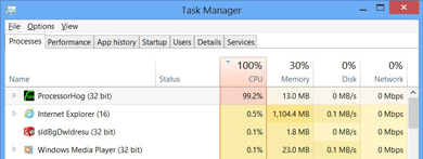
Microsoft recently spotlighted Windows 8's improved Task Manager, most notably the new color-coded "heat map."
The Windows 8 Task Manager was first unveiled almost two years ago, but the heat map is a recent -- and perhaps the most helpful -- addition. It lets users quickly see the apps and processes that are dragging a Windows 8 system down using color-coded alerts, ranging from yellow to red, with red indicating the big resource hogs. Information is provided dynamically and in real time, and users can release the threads of the more problematic apps by right-clicking on them. This Microsoft blog post, published last week, shows screenshots and a video explanation.
 [Click on image for larger view.] The Windows 8 Task Manager heat map. (Source: Microsoft)
Task Manager for Windows 8 still maintains the familiar tabbed menu structure seen in Task Manager for Windows 7. The old user interface wasn't obliterated by the ribbon menu, which suggests that Task Manager runs on the "Desktop" user interface side of Windows 8.
Task Manager's opening screen is just a simple list of running apps, allowing users to quickly kill them. The more complex tabbed view gets displayed after the user clicks on the "more details" link located at the bottom of Task Manager.
With Windows 8, Microsoft added two new tabs, "App History" and "Startup." The App History tab shows a 30-day rolling chronicle of apps, displaying Windows Store Apps use by default. The new Startup tab allows users to sort applications by name or by impact. Each startup app can be easily disabled by just right-clicking on them.
The Processes tab is now the leading default tab in Windows 8's Task Manager. Processes are now sorted alphabetically by app name, followed by third-party process name. Users can now see the individual DLLs running in an SVC host, and they can stop them.
The Performance tab shows the overall resource utilization, with individual "minigraphs" specific for CPU, memory, disk and network. Each minigraph can be expanded into a floating window. CPU resource use is more specific now, and includes views of NUMA nodes and logical processors. Microsoft got rid of the old Networking tab by folding it into the Performance tab.
The Details tab looks like the old Processes tab in Windows 7's Task Manager. Right clicking on a process in the Details tab brings up an "analyze wait chain" option, which can be used to help determine if an application isn't responding because it's waiting for another process.
The Services tab still seems as obscure as ever. However, if a user right-clicks on a service, a search box now pops up pointing to information on the Web written about it. That's a bit less clunky than the old way of having to type an obscure service name into a browser's search engine.
About the Author
Kurt Mackie is senior news producer for 1105 Media's Converge360 group.