8 Great Partner Web Sites To Inspire Your Makeover
You've been putting it off for too long. You know your Web site needs an update -- especially if it's not mobile-friendly -- but its redesign keeps going to the bottom of the list.
Summer is just around the corner, and with a slower pace of business, it's a great time for a Web site makeover. To inspire you to make the commitment, we found some partners who are setting the pace with stand-out Web sites.
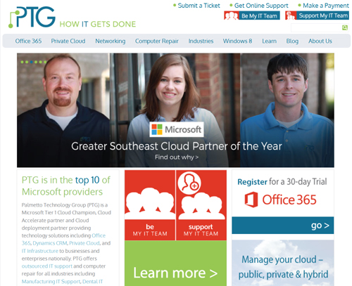
1. Palmetto Technology Group, an Office 365 partner, has a history of staying ahead of the marketing curve. Its Web site has a clean design with photographs of real people. It's mobile-friendly, offers lots of content and makes it easy for a visitor to make contact.
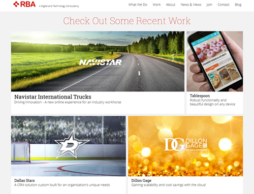
2. Clean design and limited text make the Web site of system integrator RBA Consulting immediately engaging. No big words, no clichés and leading with customer stories set a non-tech tone that is likely to appeal to business decision makers. The customer stories are a refreshing break from the problem/solution/benefits case study drudgery.
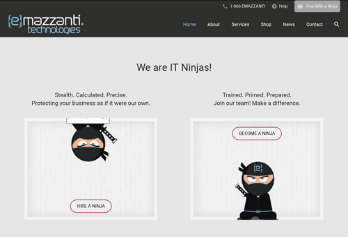
3. The home page of eMazzanti Technologies, an SMB partner, gets straight to the point with a description of who it helps and what services it delivers. It offers content in a variety of forms, including blog posts and videos, on the home page. It's nice to see a sense of humor at the bottom of the main page with some IT Ninjas. We need more of that in the channel.
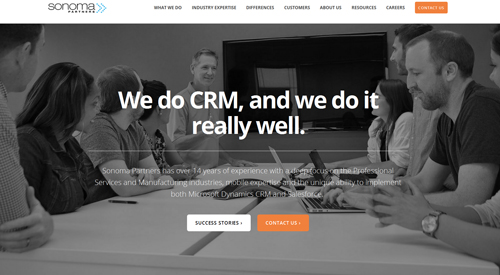
4. Sonoma Partners cuts to the chase, as well, with very efficient use of words. It handles the challenge of establishing credibility for multiple industry specialties especially well. On the home page, in just a couple of sentences, Sonoma Partners conveys its industry knowledge in three different vertical markets.
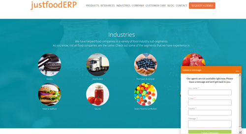
5. For those partners who want to take their vertical marketing a step further, justfoodERP is an example of an industry-specific site done right. In addition to effective use of bold graphics, the site is full of educational content and customer stories. The live-chat pop-up is a nice touch.
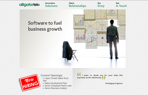
6. The strength of Alligatortek's Web site comes through its focus on customers. With an entire section dedicated to client relationships, the custom development partner sends a strong message on its top priority.
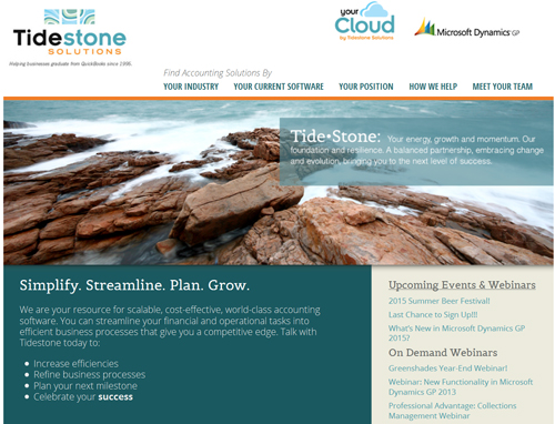
7. Tidestone Solutions, a Dynamics ERP partner, makes a personal connection with readers by labeling its site sections "Your Industry" and "Your Current Software" -- a subtle but effective detail. Tidestone appears to be perfectly comfortable showing the size of its team and making introductions to its consulting team. Targeting those companies looking for personal, caring service, it makes a strong case.
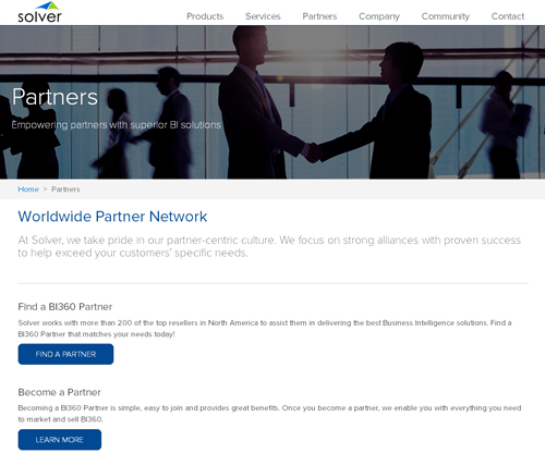
8. Designing a Web site to connect with partners effectively is a challenge for every ISV. Business Intelligence ISV Solver has clearly given a lot of thought to that challenge. The partner overview page defines the options without clutter, directing visitors down the right path without confusing them.
These are just a few examples of the many partners doing a great job with their online presence. Your site doesn't need to be state-of-the-art -- just informative and engaging (and work across devices). Now that you have some fresh inspiration, it's time to get started.
Have a Web site success story? Add a comment below or send me a note and let's share the knowledge.
Posted by Barb Levisay on March 16, 2016