First Impressions of the Windows 10 January Build
If Windows 10 is going to keep Microsoft relevant, the operating system has to fill two tall orders that conflict. It's got to be an attractive operating system for tablets, phones and 2-in-1s that is loaded with forward-leaning features. At the same time, it must provide a more intuitive interface for legacy Windows users who need to be able to get stuff done from the keyboard and mouse.
A critical milestone release in Microsoft's effort to ship Windows 10 in 2015 came on Friday with the January build of Windows 10. Build 9926 closely followed the major consumer event last week about forthcoming features in the operating system, and the new release delivered many of its hotly anticipated features.
While not quite a beta, Build 9926 is the first major release since November and provides an outline of how the OS will work. For those who haven't tried a Windows 10 build previously, it's a good place to start. At first blush, it's relatively easy to use from a point, click and type standpoint. Absent major UI changes in future releases, users will need some training to get the hang of Windows 10, but not nearly as much as Windows 8 and Windows 8.1 required.
Pre-Installation
To get the new build, Microsoft simply asks that you sign up for the Windows Insider program and meet the minimum system requirements. Most aren't too severe -- 1GHz or faster processor, 1GB of RAM for a 32-bit system or 2GB of RAM for 64-bit, a Microsoft DirectX 9 graphics device and a Microsoft account. The OS footprint on disk, however, is hefty at 16GB. Many systems these days have embarrassingly large hard drives. But at a time when online services are offering oodles of storage for free or for cheap, many other systems skimp on hard drive size to beef up on other features at a price point.
In my case, trying to pry free enough storage space to load the preview build was the most time-consuming part of the installation process. Once begun, the install process was relatively seamless and maintained most of the Windows 8.1 settings that were previously in place.
Starting Up
The first noticeable change moving from Windows 8.1 to Windows 10 is where Windows starts. The new version boots into a traditional desktop, largely indistinguishable from Windows 7 except for some minor changes to the Taskbar. No unfamiliar tile interface fills the screen, as in the default Windows 8/8.1 configuration.
The Start Button is in the expected place, right from the beginning. Score one for the legions of users who complained loudly and often about Windows 8's lack of a Start button. Windows 8.1 brought it back, but it behaved differently than the old Start button, serving as a toggle between the Desktop and the tile-heavy Start Screen. The idea behind Windows 10's Start button appears to be combining the best of the legacy Windows 7 Start button and the tile interface of the Windows 8-generation Start Screen.
 [Click on image for larger view.]
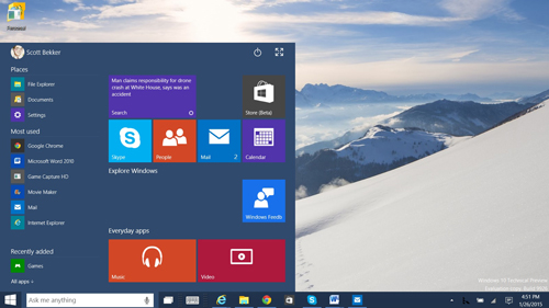
The Start Menu for Windows 10 is a cross between the old-style menu of Windows 7 and the Start Screen of Windows 8, with a Cortana Search box thrown in for good measure.
Clicking on Start calls up a menu that fills about half the Desktop screen. Along the left column is a list of apps grouped into "Places" such as File Explorer, Documents and Settings; "Most Used" with a list of your go-to apps; and "Recently Added" for new apps. Below that is an option for listing "All apps," which are grouped alphabetically much like in the Windows Phone Apps list. Rather than a regular Search box, the Start interface pops the cursor into Cortana's search box (more on that later), for users who want to type in what they'd like to open.
In the large portion of the Start Menu to the right of that main column are tiles that look similar to the Windows 8 tiles. The top-right corner shows a Power button and a button for expanding the Start Menu into a Windows 8-style Start Screen.
The Windows 10 Start Menu tries to be all things to all people, and does a decent job of it.
Cortana
A headline feature of Windows 10 is the integration of Cortana, Microsoft's personal digital assistant that had its debut in Windows Phone 8.1. By bringing Cortana to the desktop, Microsoft is introducing a new input method to the Desktop in a way that's appropriately take-it-or-leave-it.
Cortana's home is a small Search box on the Taskbar just to the right of the Start Button. Inside the Search box are Cortana's trademark triple-circle on the left side and a microphone button on the right. Those who want to search the old-fashioned way can type in their queries. Those who want to search using voice can hit the microphone and ask a question out loud. A new feature, not yet available to Windows Phone users, is the ability to launch searches by saying, "Hey Cortana," without clicking, typing or touching anything. The feature must be turned on in Cortana's settings, and in this early build it only responded to me about a third of the time.
 [Click on image for larger view.]
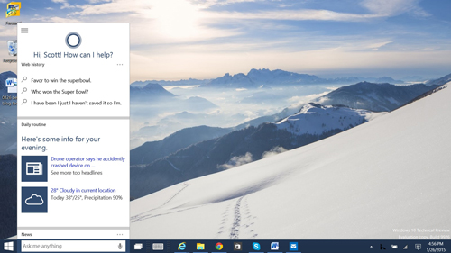
Cortana opens in a window that is similar in size and dimensions to the appearance of the digital personal assistant on a Windows Phone.
Clicking on the Cortana box causes a phone-sized window to pop up, giving a very similar user experience to the one on the phone. Meanwhile, executing a Cortana search for files on the PC or in OneDrive kicks off a larger window for results. Many searches will simply launch a browser window with Bing results.
The Cortana integration at this point is at best a preview with a lot of bugs and seemingly unpredictable behavior. For the record, it's also only available in the United States and in English. I'll take a more detailed look at the Cortana experience over the next few days.
Bye-Bye, Charms
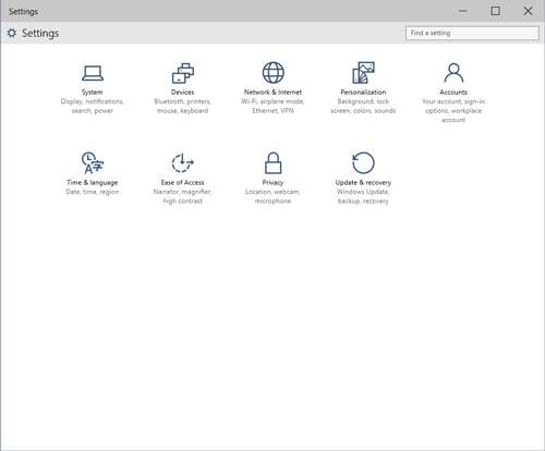
One of the hardest things for users to get the hang of in Windows 8/8.1 was the Charms. Those going straight to Windows 10 from Windows 7 won't have to figure them out because they're gone (for now). The infamous swipe-in-from-the-right border to bring up the vertical bar of icons for sharing, going to the Start Screen or changing Settings, along with surfacing the clock and battery level, is no more. In Build 9926, users click on Settings in the Start Menu. It's a simpler and more intuitive process.
 [Click on image for larger view.]
The Windows 8 Charms are gone. Now users access Settings from the Start Menu. Pictured: The new Settings icons.
Task View
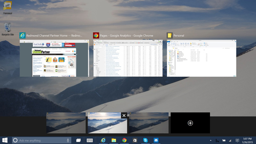
One element common to Linux distributions that was added to Windows 10 in the fall is the Task view. Accessed from an icon on the Taskbar, the Task view allows users to create several simultaneous desktop environments. For example, one Desktop might have Word and Internet Explorer open for writing a report, while another desktop might have an Excel spreadsheet and a browser open to statistical Web pages, while a third environment might have some games running.
 [Click on image for larger view.]
A "Task view" icon on the Taskbar allows you to switch among several desktop environments, with different applications open on each.
Tablet Mode and Continuum
An important concept in Windows 10 is Continuum, which means that users with 2-in-1 devices like the Surface will have one experience when the keyboard is attached and the OS will switch seamlessly to another experience when the keyboard is detached. It's possible to manually switch to tablet mode by clicking on the Notifications icon, which looks like a speech bubble, on the far right side of the Taskbar.
Tablet mode is for touchscreen devices, and the swipe motions are different from those in Windows 8. Swiping in from the right brings up the Notification window. Swiping in from the left puts all the open windows in a line, where they can be selected or closed.
Future Features
Some of the most significant features of Windows 10 aren't in the January build. Not included is "Project Spartan," the code-name for the new browser that includes a new engine, UI, tab management, built-in annotations, a Reading Mode and Cortana integration. Also not included are universal app versions of Outlook, Word, Excel and PowerPoint. The holographic Windows features that will work with the HoloLens device are coming later, as well.
Conclusion
One of the big questions about Windows 10 is whether the user experience will be good enough for non-touch, legacy users. From a full day of experimenting with the OS, the answer is an unqualified yes. The Windows 10 January build is intuitive enough for mouse and keyboard use, and the OS has enough bells and whistles to make the experience interesting for tablet users. The new input methods either need work (Cortana) or have yet to be delivered (Spartan annotation and HoloLens), but Microsoft's promised faster cadence of builds from here on out should bring rapid development on those fronts.
Posted by Scott Bekker on January 26, 2015