Do Your Web Site Colors Scream 1997?
Are your corporate colors navy blue and gray, with maybe a little maroon thrown in to spark things up? When most partners were choosing corporate colors more than a decade ago, they wanted to evoke security and stability. Think pinstripes. Those were good decisions at the time.
Now, it's time to update. An ever-increasing number of your buyers are digital natives. Security and stability are still important to them, but when they hit your blue-and-gray Web site, they see stodgy, out-of-date.
Our visual experience would be pretty boring if styles and designs stayed the same all the time. Microsoft has led the current design revolution in flat design and bold color choices. Coming from a company whose current image is not exactly innovative, it's been an impressive transformation.
Following Microsoft's example, 2014 is a great year for all partners to re-evaluate their color choices and update their Web sites. Color choices are especially important for those partners who are following Microsoft's lead -- bold colors are what makes flat design work. A good example is Microsoft's by the numbers Web site.
The Brand Is Not Sacred
Some marketers are shaking their heads: "We can't change the brand." Not to put too fine a point on it, but, "Baloney."
Unless you are in the same league as Coke or Microsoft, your brand is probably not recognized and certainly not remembered. Think about your primary interactions with your customers and prospects -- they're probably almost exclusively through e-mail. They don't see your logo until they have read through the e-mail and looked at the signature line.
When your customers access the customer portal, or prospects visit the Web site for content, do they smile? Is it bright and cheerful or dark and sterile? It's likely that a little yellow or purple could really liven things up.
Inspiration
To give you some inspiration, check out Adobe's "Kuler" color scheme designer. Fair warning: It's addictive even for non-marketers.
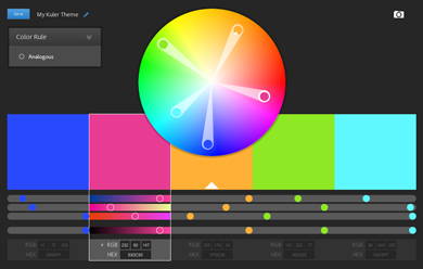 Adobe's Kuler color wheel.
Fortunately, there are some great examples from partners, as well. Hats off to these partners who have taken those first, bold steps away from midnight blue. Seriously, check out these examples to see that your business can still look professional and trustworthy when you use bold colors:
Just Like Technology, Color Trends Change
Design is transient. Don't get too caught up in the fear that you won't like the colors in a couple of years. You should update your Web site every two years to stay current with design trends. The good news is that those updates are getting easier with every passing year.
Have some fun -- spin the Adobe Kuler wheel and pick a set of bold colors. You'll make an impression on customers and prospects more quickly when you add a little color to their lives.
Are you using bold design to differentiate yourself? Add a comment below or send me a note and let's share the knowledge.
Posted by Barb Levisay on January 30, 2014