Hewlett Packard Enterprise Unveils New Logo
Meg Whitman rolled out a new logo for Hewlett Packard Enterprise on Wednesday, and her blog post revealed that she's sweating the smallest details.
By the end of its fiscal year on Oct. 31, HP is committed to splitting into two roughly equally sized independent companies -- Hewlett Packard Enterprise and HP Inc. Whitman will be CEO of Hewlett Packard Enterprise, which includes HP's servers, storage, networking, services, software, cloud and converged systems.
Dion Weisler will run the other company, called HP Inc., which includes notebooks, desktops, mobility, printing, managed print services and graphics. Whitman will be non-executive chairman of HP Inc.
Behind-the-scenes work has been going on since the planned split was announced six months ago, but this week Whitman unveiled something visible in the form of a new logo for Hewlett Packard Enterprise. It's a simple green rectangle above the company name.
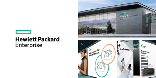
"We needed a design that would express our renewed commitment to focus and simplicity," Whitman wrote, adding about the color of the green, dollar-bill-shaped rectangle, "The color we picked is no accident."
A smaller detail in the logo involves the way the letters connect.
"Maybe you noticed it, but take a look at the name 'Hewlett' in the new design. This is the first time in our history that the two t's in Hewlett connect," Whitman wrote. "That connection is symbolic of the partnership we will forge with our customers, partners, and our employees -- what we will do together to help drive your business forward."
Whitman and the HP team are thinking deeply about the little things. It's good to see partners near the symbolic center stage in that thought process.
Posted by Scott Bekker on April 16, 2015